Jan 6

Jen’s Richmond Reno: New (Old) Fireplace Mantels!

This house was built in 1908. Who knows how many people have lived here/died here/made breakfast here/celebrated Christmas here. This house will outlive me by decades…maybe even centuries. It’s a good thing I don’t really believe in ghosts, because if I did, I’d be surrounded by them.

pin it!

A few months ago I was demolishing my old dining room fireplace mantel, and I found this wedged in the baseboard  — a tintype that could date back as far as 1850. I would love to know more about who these people are — did they own the house? Did they build the house? Were they family? For now, I have named them Alfred and Gertrude. I plan on leaving them in the house forever because it seems like it would be bad luck to take them out of the home they’ve lived in for over 100 years.

pin it!

Aaaanyway, back to design. This is a pic of the living room. The old mantel doesn’t look that bad in this photo, but it was actually very poorly made and stylistically arbitrary. It was also slightly out of level, which drove me nuts. I wanted to find something more appropriate for the age of the house since this living room/sitting room is the first thing you see when you walk into the house. I was in California during most of the planning process for this house, so I started my search on Craigslist.

pin it!

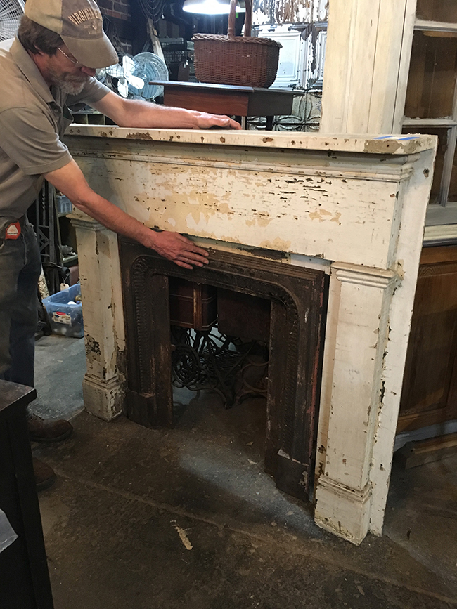
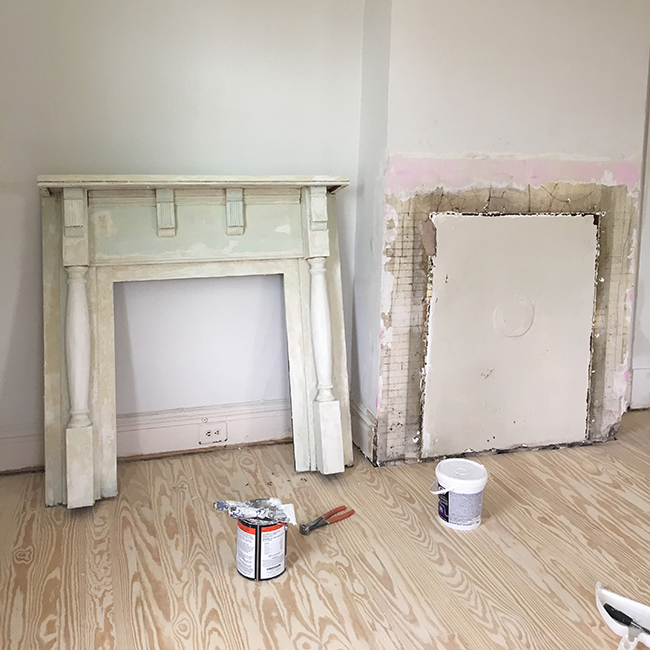
Praise the internet, for within minutes I found this little guy. I can’t say that is was love at first sight, but I definitely noticed it was proportionately similar to my old mantle. I emailed the shop and asked the sales lady to send me some dimensions. I was looking for something that was 49 1/2″ or less. She came back to me with this photo.

pin it!

49 1/4?! Literally perfect. At that point I wasn’t even going to overthink it. Even though parts of this mantel looked like it had been chewed by a hungry squirrel, I called the lady and arranged to have it dropped off at the house.

pin it!

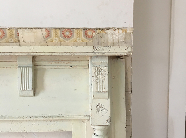
When I demolished the old mantel, I uncovered little bits of this vintage wallpaper from back-in-the day. I love uncovering little surprises like this. It makes the process of renovating feel more soulful.

pin it!

The mantel needed a ton of patching, priming and painting. I re-built all the damaged area with Ready Patch, my favorite patching compound in the world. When I’m patching raw wood, I use wood putty, when I’m patching painted wood, I use Ready Patch. At this point I’d estimate that half of my house is made out of putty and joint compound of some kind.

pin it!

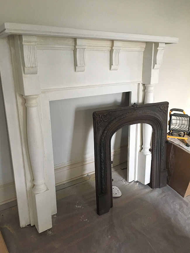
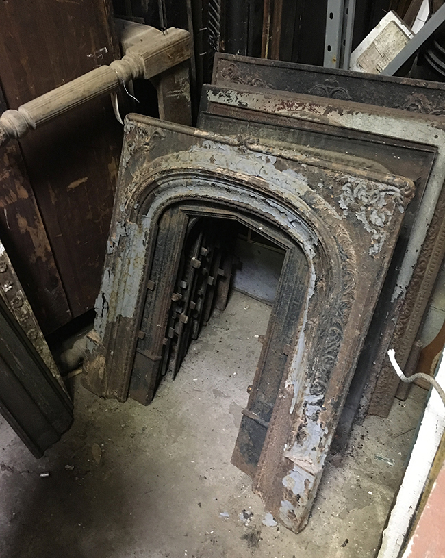
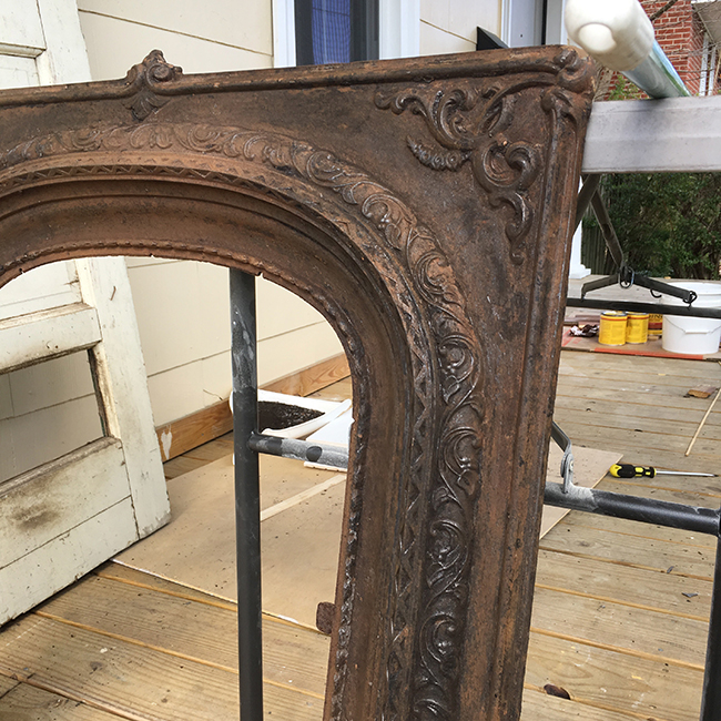
Next, I needed to find a fireplace insert. I had the hardest time figuring out what these things are called. Fireplace surrounds? Firebacks? Even after extensive searches on Google, I’m still not sure what these things are called. Fortunately, local thrift store owners understood what I meant when I said I was looking for “iron things that go inside the mantle.” One store in the outskirts of town had a ton, and I found one that was a pretty close match size-wise, but it need a TON of clean-up work. pin it!

I  spent 4 hours brushing flakes of paint off with a wire brush, polishing with an attachment on my drill, and manually picking little bits out of the crevices with various sharp tools.  pin it!

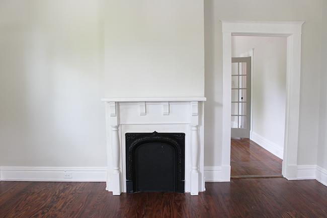
I considered just waxing the iron fireplace surround so I could preserve the rich brown color, but the surface had a lot of scratches and splotchy color inconsistencies from me scraping the paint off. This was also toward the end of my renovation, and I was feeling rather impatient, so I ended up just spraying it gloss black. It doesn’t really really have as much WOW factor in the photos, but in person it was still pretty. Here’s a pic of the mantel all cleaned up!

pin it!

pin it!

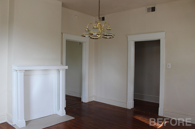
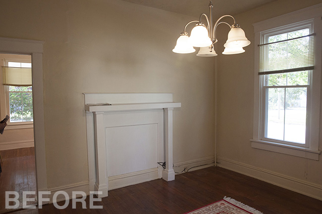
The living room shares a wall with the dining room which also has a mantel. The two mantels are back to back. This room had an even bigger, crappier mantel.

pin it!

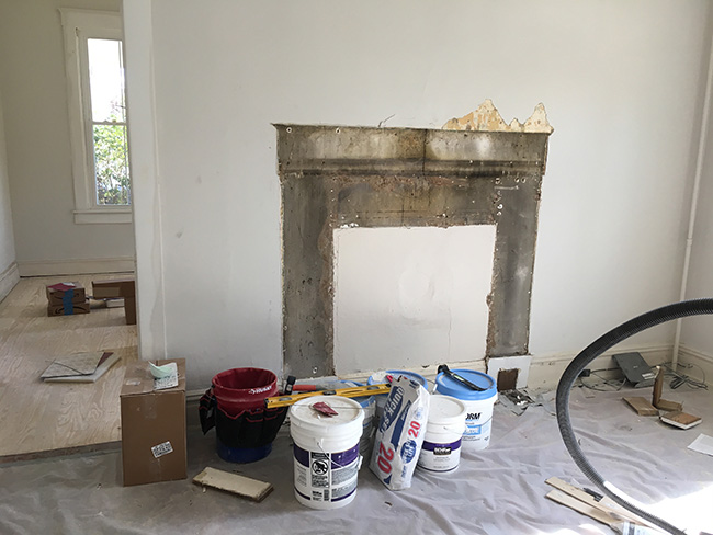
I ripped the mantel off the wall, and that’s where I found that amazing tintype of Gertrude and Alfred. pin it!

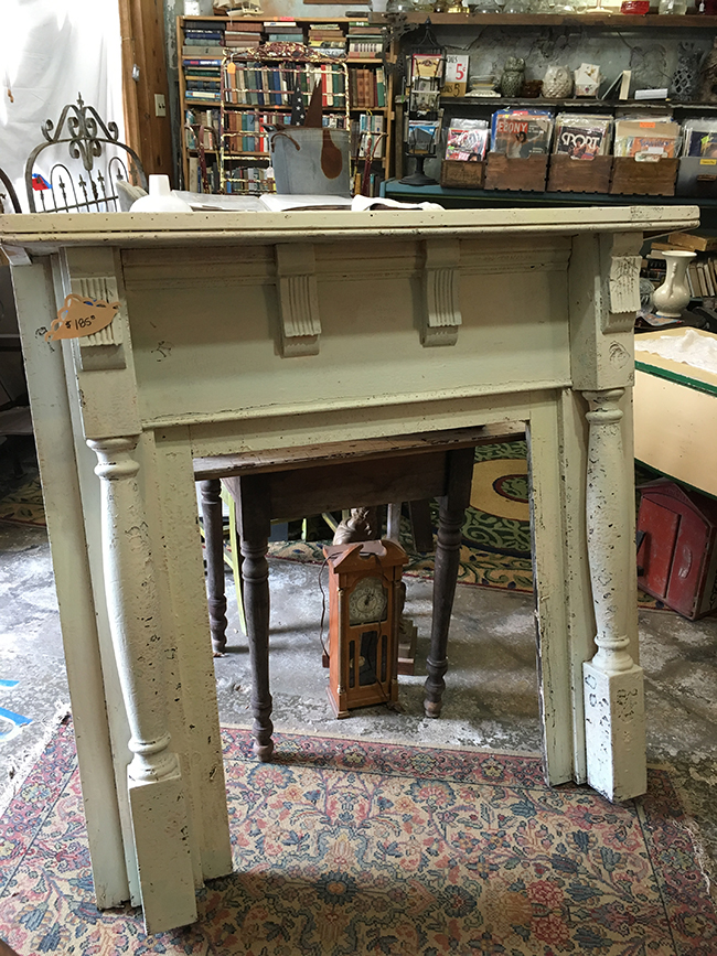
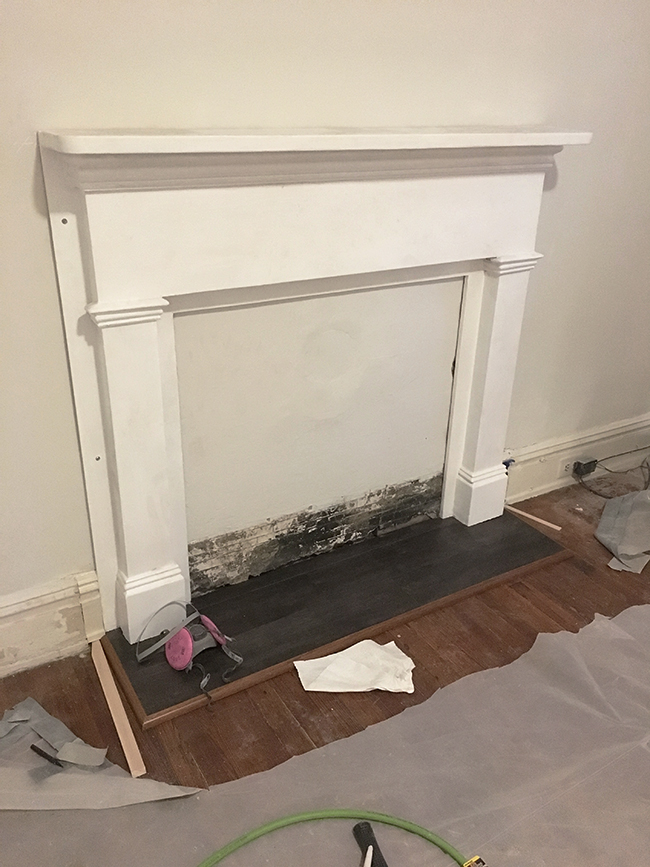
There was really no limit to how big this mantel could be, so I considered really tall mantels and really ornate mantels, but eventually I settled on one that was classic and inexpensive. I think it was about $125. I opted against doing a metal fireplace surround for this room. Again, trying to keep the project as on-budget as possible. I saw a lot of pics of faux fireplace mantels online with nothing inside them, and I thought that would look fine.

pin it!

After I patched and painted the walls, I used plaster screws to secure this to the wall. The old mantel was attached to a crappy wood hearth that was covering some damage on the floor, so I built a new hearth and installed some quarter round edging that matched the floor perfectly.

pin it!

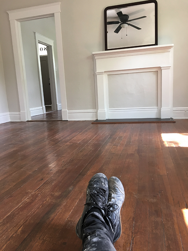
I found this simple mirror for $15 on Craigslist (thanks for lugging it for me, Christine!) I cleaned the floors and for the first time in weeks I was able to sit on the ground because it wasn’t covered in filth. Only a few more projects and I’ll be done with #jensrichmondreno! Eeeek!  Up next…upstairs bathroom.

Posted by Jen at 6:45 am — 4 comments
Categories: , ,
Nov 4

Jen’s Richmond Reno: The Downstairs Bathroom

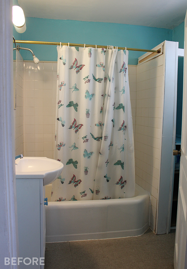
Sometimes it’s hard to fully appreciate a dramatic before-and-after transformation without seeing the “before” in person.  Photographs can be very forgiving and I often tell people that a “before” picture of a room might look decent, but TRUST ME, in real life it was looked way worse.

This is not one of those situations because for once, even in these small photos the room’s grossness really translates. Hooray! Behold, my downstairs full bathroom:

pin it!

pin it!

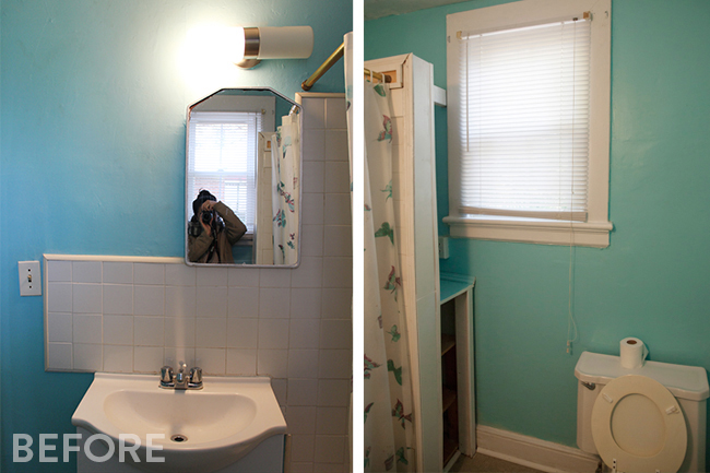
Can we just note how ridiculously off-center this cabinet and sconce are? I’m sure this was because the medicine cabinet was mounted between studs, but I’m still surprised that whoever installed this felt that this was the best possible option.

pin it!

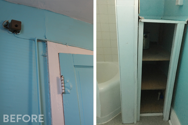
I have no idea what this wall-mounted box is. I ripped so many mystery cords and wires off the house. And let’s not forget the saddest little corner of the house — this janky divider wall and adjacent cubby made entirely of scrap wood.

pin it!Side note/pro tip: bathtubs make the best scrap wood bins :) pin it!

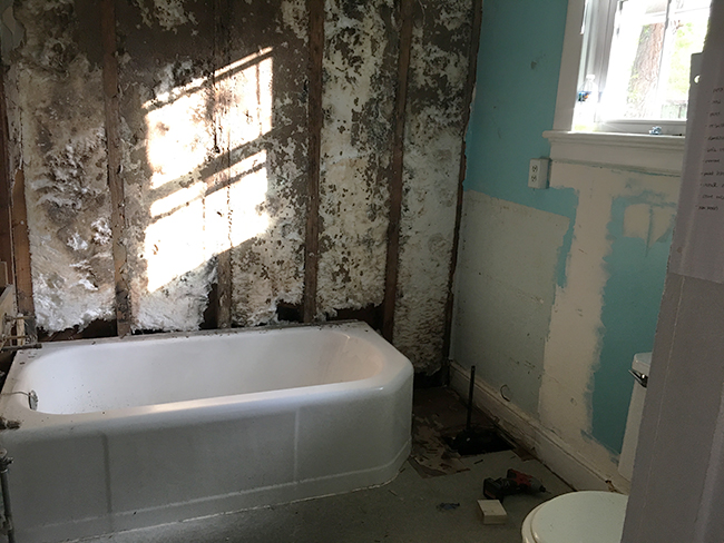
The walls in this room were so spongey and soft from moisture that we had to rip all the drywall out. My first instinct was to lose that divider wall completely. When I knocked it down, it did make the room feel a lot bigger. There was more natural light without the big wall in the way. Unfortunately, losing the wall would have meant having to get a 90 degree shower curtain rod that would wrap around 2 sides of the tub and I would have sacrificed all the storage in the room.

pin it!

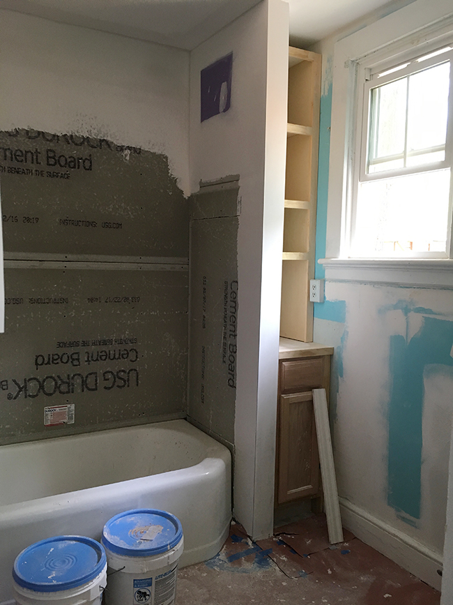
In the end I decided to re-build the wall with way more support, then install a 12″ wide kitchen cabinet from Lowes and build custom shelving above it to fully utilize the small space.

pin it!

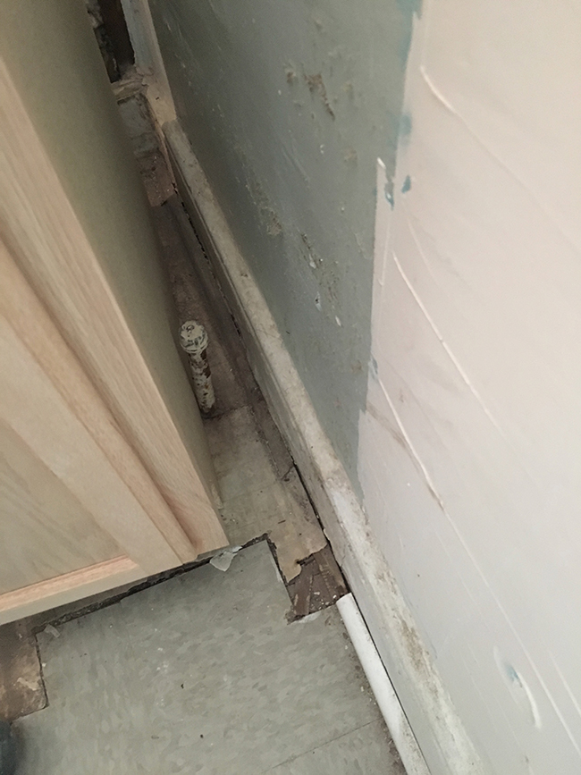
My lower cabinet wouldn’t fit in the nook because there was this annoying pipe coming up from the ground. My plumber said it was a gas pipe and suggested that we just cut it shorter and cap it off under the house. pin it!

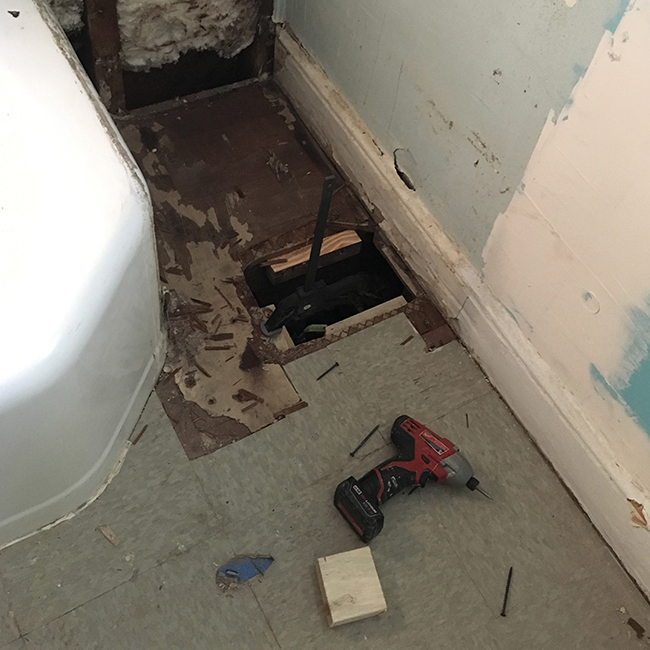
And that’s how I wound up with a huge hole in the floor. We had to make the hole big enough for my plumber to fit his hands in there so he could cut and cap the pipe. Fortunately we didn’t have to make the floor patch pretty. We just secured some plywood over it and covered it up. pin it!

pin it!

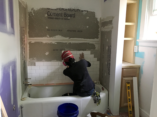
It’s safe to say that this turned into a complete bathroom overhaul, but because it’s a rental, I still wanted to keep my budget within reason. I chose to use simple white subway tile and I had my awesome art assistant Jef install them with me.

pin it!

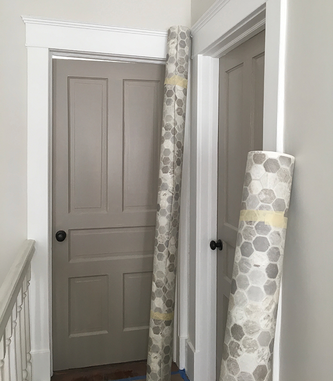
When the project was nearing completion, I was finally able to lay the new floor. I chose this amazing hexagon vinyl flooring. I saw this floor for the first time on one of the shows I art directed and I was impressed by how realistic and durable it was. It also has a subtle texture that’s so realistic that 3 of the vendors who came to my house thought it was natural stone at first. The old bathroom floor was 70s gray linoleum tiles, but they were in perfect condition, so I just laid the new hexagon flooring over it. I made a giant stencil out of paper to make sure that all the cuts would be perfect, then just plopped it down. This vinyl doesn’t even require any kind of adhesive! I did caulk the seam between the tub and the floor just in case.

pin it!

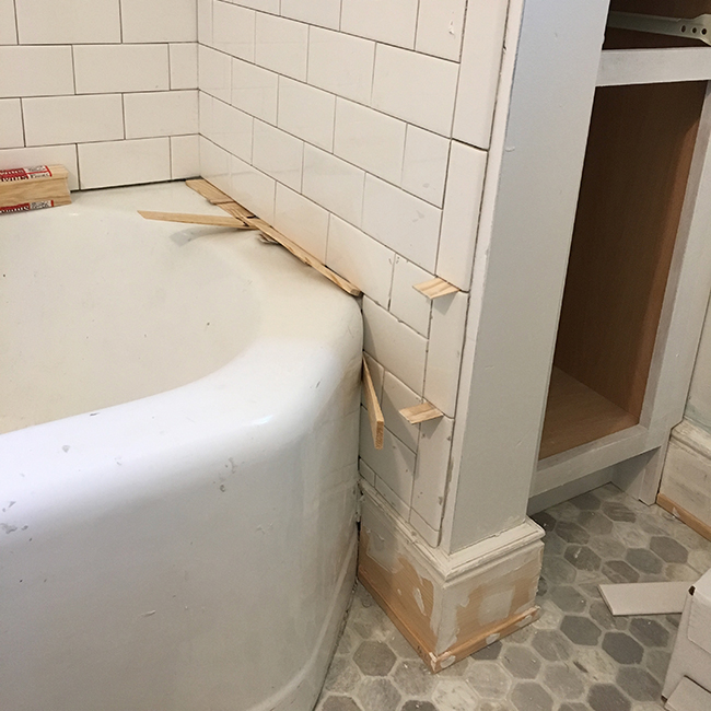
I quite liked the rounded edge of the tub, but it created an awkward little corner that was super difficult to tile. I also learned that edge tiles are incrementally smaller than regular subway tiles. WHY would you do that to us, Dal Tile?! pin it!

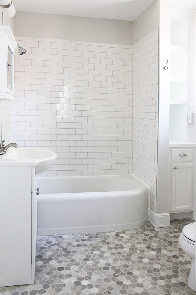
It’s not a very big room, so I really just have this one photo that gives you the best idea of what it looks like to date — super simple, bright, and clean. Up next: the upstairs bathroom renovation!

Posted by Jen at 11:58 am — comment
Categories: ,
Jul 26

Jen’s Richmond Reno: The Kitchen

I’ve always said that kitchens are my favorite room to design. I love sourcing cabinets, tiles, and appliances. I love to space plan for hours on end. I love the permanence of them — you have to make decisions really carefully because for the most part, once a design choice has been implemented, there’s no turning back! It just so happens that I also spend 75% of the year art directing Food Network shows and designing kitchen sets. Funny…I basically never cook.

01pin it!

I bought this house without seeing in in person first, so I didn’t have a great idea of exactly how much work needed to be done. Fortunately, my amazing friend Christine went to check it out for me. I trust her judgement 100% and she gave the house her seal of approval. The price was right and the bones were good.

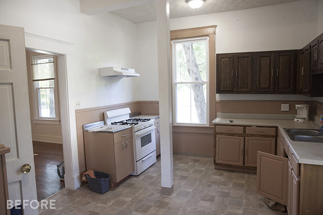
This kitchen had a few things going for it. It’s a generous size, it has big windows that let in a ton of natural light, and the cabinets are old but solid.

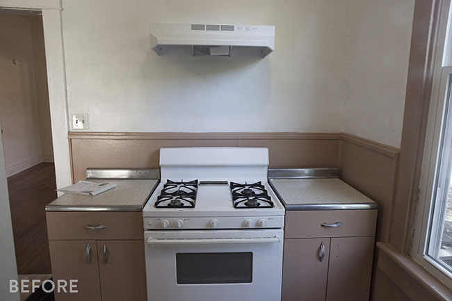
There were a few things I was definitely not a fan of. That column in the middle of the room was a bummer. At some point this space was actually 2 smaller rooms, and someone knocked down the wall and added the column for support. If I were doing a full overhaul on this space ($25-$30k) I would have considered hiring an engineer to help me figure out how to make the column go away, but honestly, when you’re in the space, the column is not terribly offensive. I knew that something like a column wouldn’t be a deal breaker for a renter considering how great the rest of the house was, so I decided that the column was going to stay. The linoleum flooring was not particularly attractive, but it was brand new and in perfect condition so I decided going to keep it.

03pin it!

The stove was in fine working condition (I actually have this exact stove in my apartment in NYC and I love it even though it’s very basic.) The cabinets on either side were made out of metal that had been dented over the years. Wood cabinets are more appropriate for the age of the house, so I got rid of the metal cabinets. And that range hood. SIGH. What a sad, sad little guy…all alone on that big wall.

02pin it!

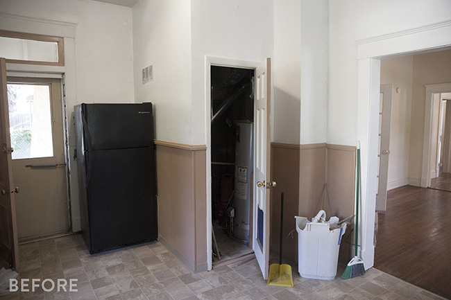
The other side of the kitchen was a mess. There was a closet that housed the HVAC system and a big black fridge that was weirdly disconnected from the rest of the space. I spent hours thinking of ways to make the fridge seem less awkward. Do I move it forward? Do I turn it 90 degrees? Do I buy a sexier fridge and just leave it where it is? More on that later…

4pin it!

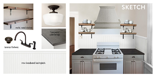
I whipped up this moodboard in LA while anxiously waiting  for the house to close — fantasizing about how this simple kitchen renovation could be done in a week or so. In theory, my plan was simple:

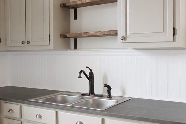
-Install new (faux) beadboard and bring it up higher so it reached the bottom of the cabinets

-Replace the metal cabinets, clean up the existing wood cabinets, and repaint everything to match

-Install a new dark laminate countertop

-Build a big range hood for drama

-Switch out all hardware and add bronze accents throughout

05pin it!

Oh, but it’s NEVER that simple, is it?! I was surprised to discover that the most time consuming project in the entire house turned out to be the beadboard in the kitchen. The story is so boring I almost don’t want to talk about it…but I’m going to talk about it anyway.

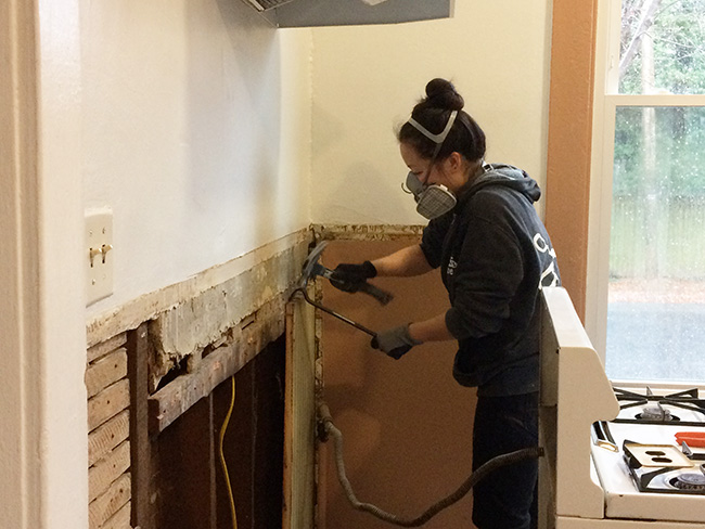
When I bought the house, there was some poorly installed trim and cheap, crappy panels on the wall. Once I ripped those off, I discovered that there was already original, authentic 3/4″ thick beadboard on the original walls of the house, but not on the walls that were added later.  My initial plan was to take all the beadboard off and just start over so it would all match. I started yanking all of it off until I realized half way through that some of the beadboard was actually insulating the exterior walls of the house. I had a bit of a freakout, put all the beadboard back and went with plan B.

Plan B was to add some furring strips across the entire room so I could run the beadboard higher, then go over what was already there. Let me tell ya – it’s not an easy task to install beadboard in an old wonky house with plaster walls. Beadboard basically adds a subtle vertical striping to a room, and it has to be installed SUPER level in order to look right. If it’s even the tiniest bit off, you can really tell.

06pin it!

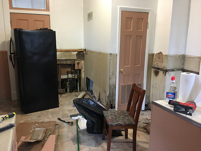
This was definitely one of those situations where it got a lot worse before it got better. Apparently the awkwardly placed refrigerator was hiding  the plumbing to my downstairs bathtub. When I rolled it to the side and ripped off the flimsy paneling, I found this mess behind it.  Some of the old drywall cladding the HVAC room was dried out/water-damaged/crumbling and needed to be replaced. Every time I removed a big nail from the original plaster, a huge chunk of wall came out with it. And can I just point out that hideous vent on the little door to the furnace room?

07pin it!

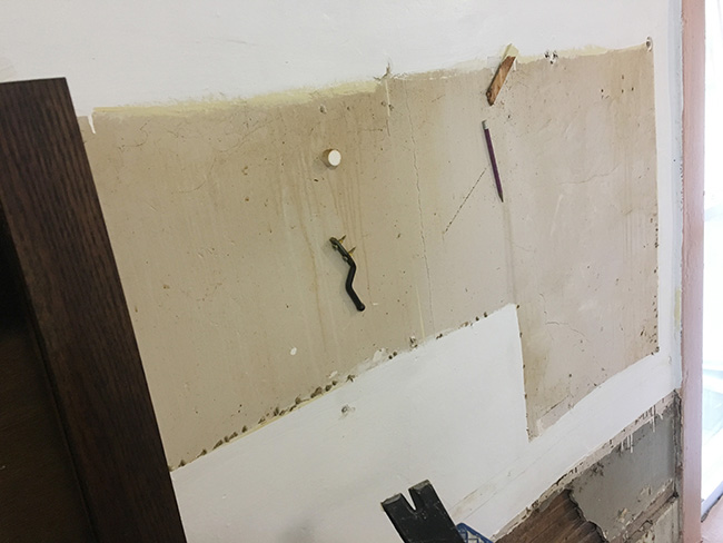
A bit of hilarity — I removed the upper cabinets in order to sand/prime/paint, and I found all kinds of weird stuff smashed into the wall, stuck on by 70-year-old kitchen grease.

08pin it!

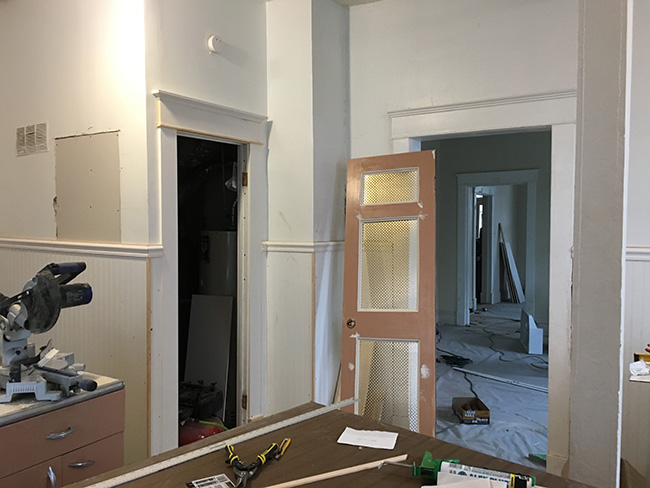
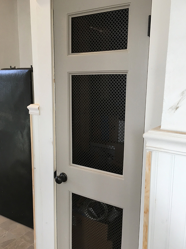
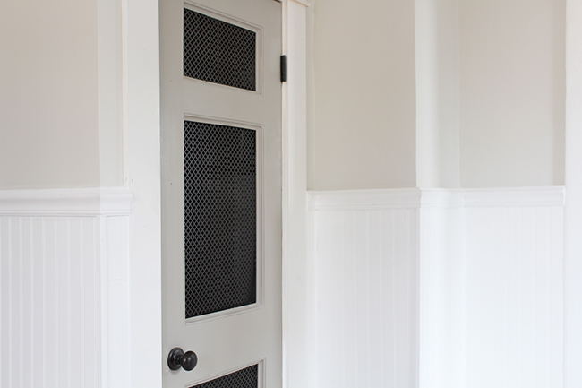
Remember that dumb little door with the vent leading to the HVAC room? I kept the door, but decided to give it makeover. I cut out all 6 of the recessed panels and added metal radiator grates so it would allow for plenty of ventilation.

09pin it!

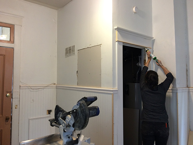
Even though this little door was leading to basically a closet, it was located right next to the doorway  to the dining room which had pretty original trim on it. I decided to build out the trim around the HVAC room doorway to match. Original trim on the right, new trim on the left. It’s not exactly the same, but it’s pretty darn close. I’m obsessed with moulding. I spent 10x what I had initially planned on moulding because I kept finding different places that I wanted to add it.

10.5pin it!

White caulk is my best friend! I’m seriously considering doing an entire post on caulk because I am so passionate about it.

06.4pin it!

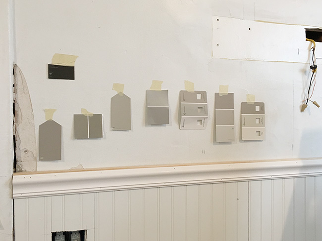
I’m sure you are all shocked that I chose gray for the cabinets! This color is Valspar Montpelier Ashlar Gray (6004-1C) It has a lot of warm undertones and I liked it so much in the kitchen that I ended up painting every single interior door in the house this color.

10pin it!

A closeup of my little furnace room door. New bronze hinges and knobs for the whole house, y’all!

11.5pin it!

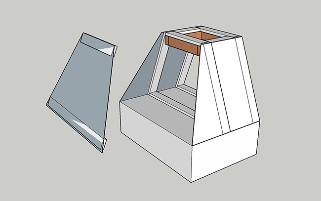
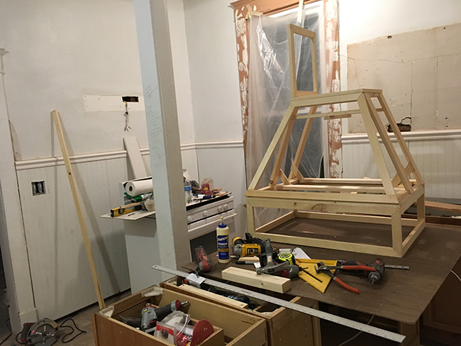
Remember the cheap white range hood over the stove? I built a big dramatic wood hood to go over it! The design was relatively simple, but it had some crazy angles, and I didn’t have a table saw at the time, so it definitely took some ingenuity to engineer.

11pin it!

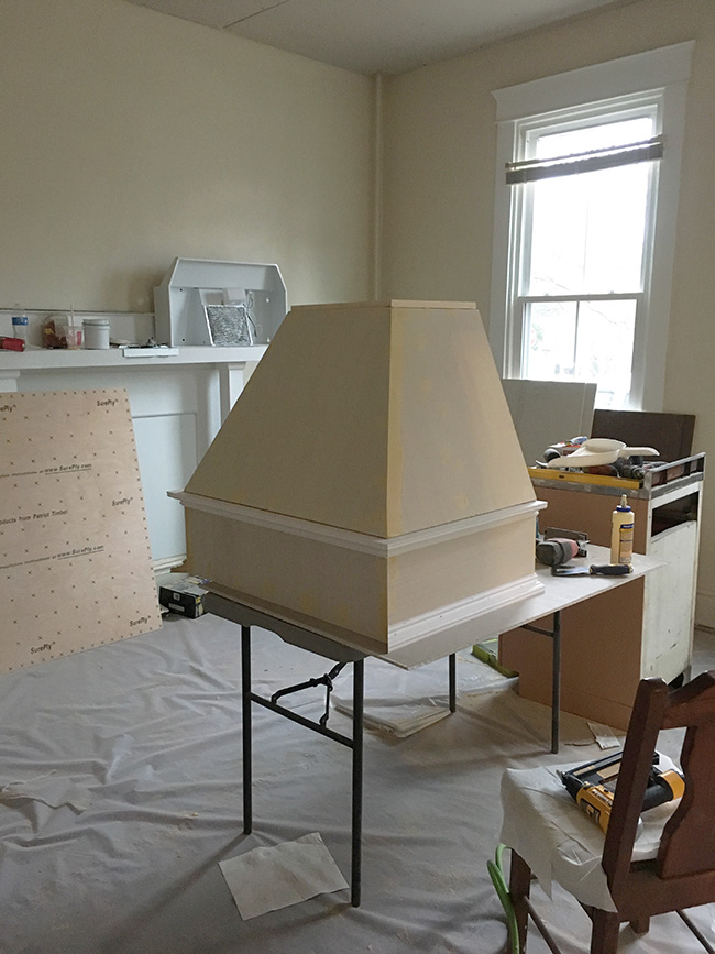
I built the frame out of light-weight pine and wrapped it in 1/4″ plywood. It’s been a while since I had to build something with weird angles. It was nice to use my brain in that way again.

12pin it!

A little crown moulding, and BAM. Instant impact and drama! Only cost me about $100 for materials.

13pin it!

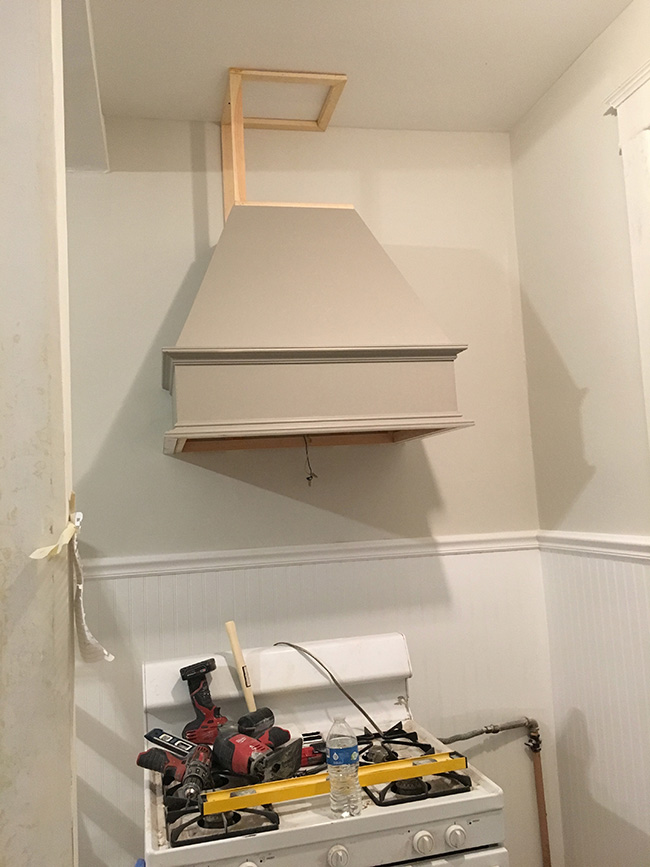
I built the bottom part of the hood first, then I mounted that to the wall and added the vertical shaft separately so all the side panels would be super flush with the wavy plaster wall.

16pin it!

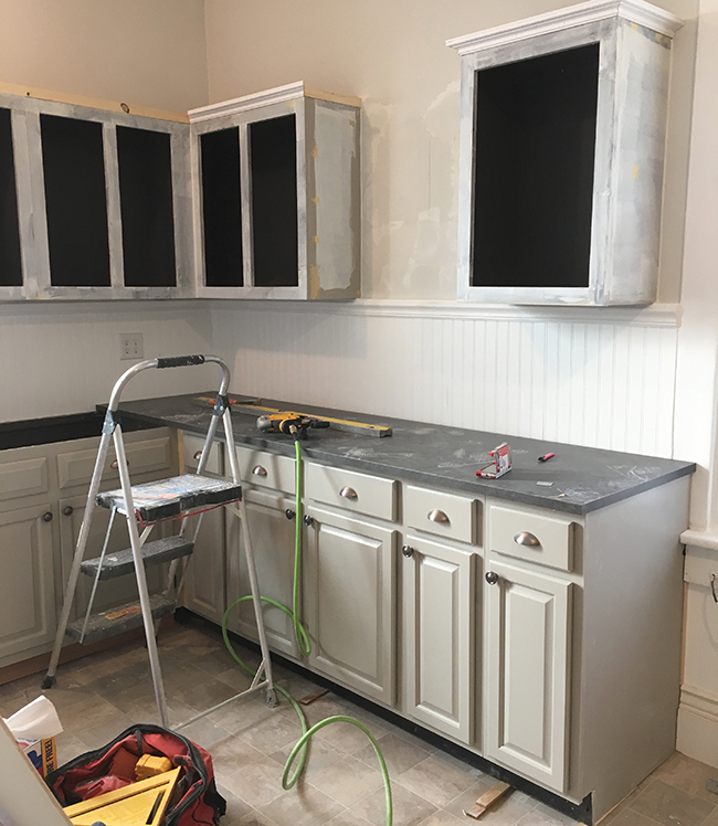
Because I am a perfectionist, rather than paint the cabinets while they were in place, I took all the cabinets off the walls, lugged them to the garage, removed all the doors and hardware, cleaned them with degreaser, sanded, puttied, sanded again, primed, and painted. Then I hung them back on the wall and added the same crown moulding that I used on the hood to give them a more high-end look.

02pin it!

Earlier in the post I mentioned that I had the hardest time figuring out what to do which the fridge which was positioned awkwardly in the corner of the room.

16.5pin it!

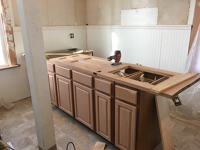
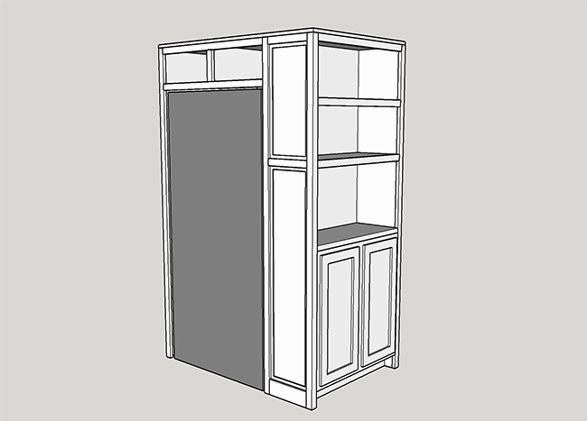
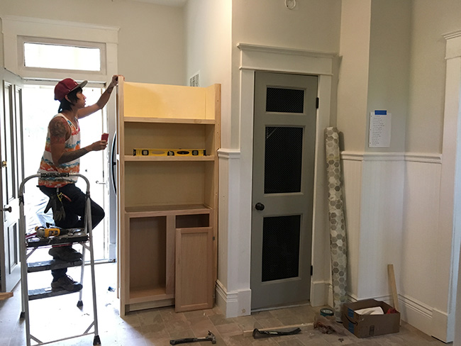
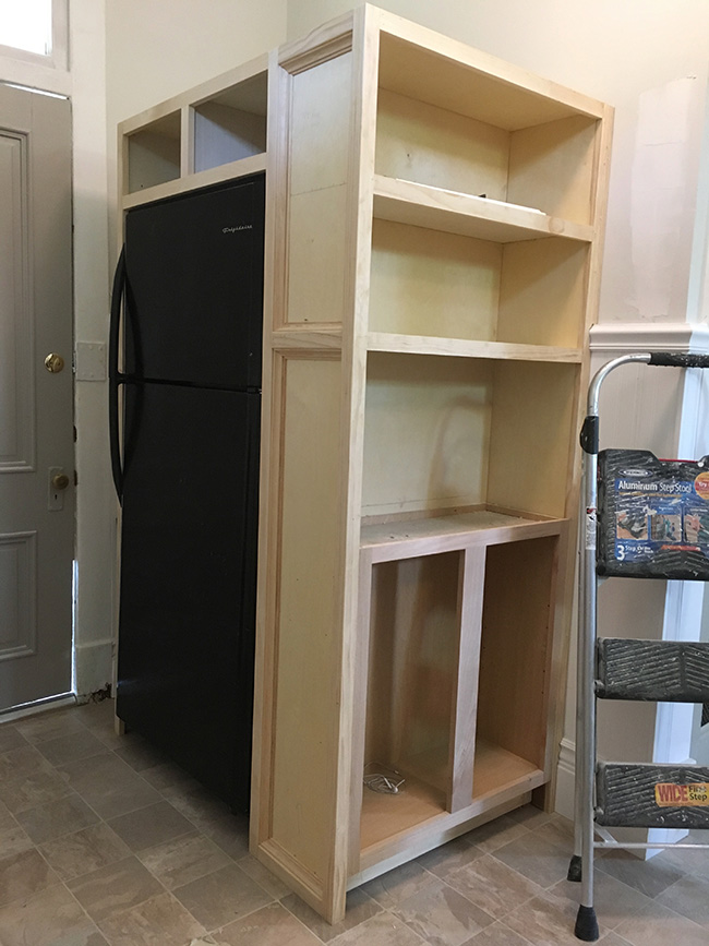
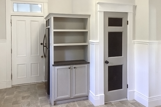
After considering about 5 different solutions, I finally landed on this sketch. I created a shelving unit that faced the kitchen, then turned the fridge 90 degrees so you access it from the side. You basically don’t even really realize the fridge is there, which is great because the fridge is in good condition but kind of dated.

17pin it!

After working on my house alone for 6 weeks, I was pretty exhausted so I flew my amazing art assistant, Jef out to Virginia to help with the last leg of my project. I couldn’t have wished for a better apprentice to help me get everything done! YOU ARE MY HERO, JEF! I owe you a thousand steaks and bowls of macaroni and cheese.

18pin it!

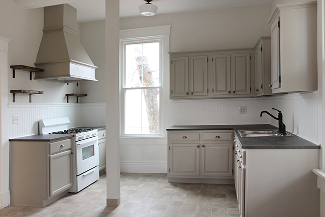
In the end, the kitchen alone took me 2.5 weeks, working 16 hours/day. It was definitely a very time consuming project and I spent about 35% more than I had budgeted. Once I started, I was 100% committed and couldn’t stop until everything was pretty much perfect. It was totally worth it though. I didn’t want to show the house to potential tenants and feel embarrassed by the kitchen. Since the kitchen was the first room that was (mostly) finished, I spent the most time in there of any room in the house and became really attached to it. Here are some “after” pics!

19pin it!

20pin it!

fridge_smallpin it!

21pin it!


Posted by Jen at 3:52 pm — 1 comment
Categories: , ,
Jul 23

Jen’s Richmond Reno: How Many Different Ugly Ceilings Can One House Have?

02pin it!

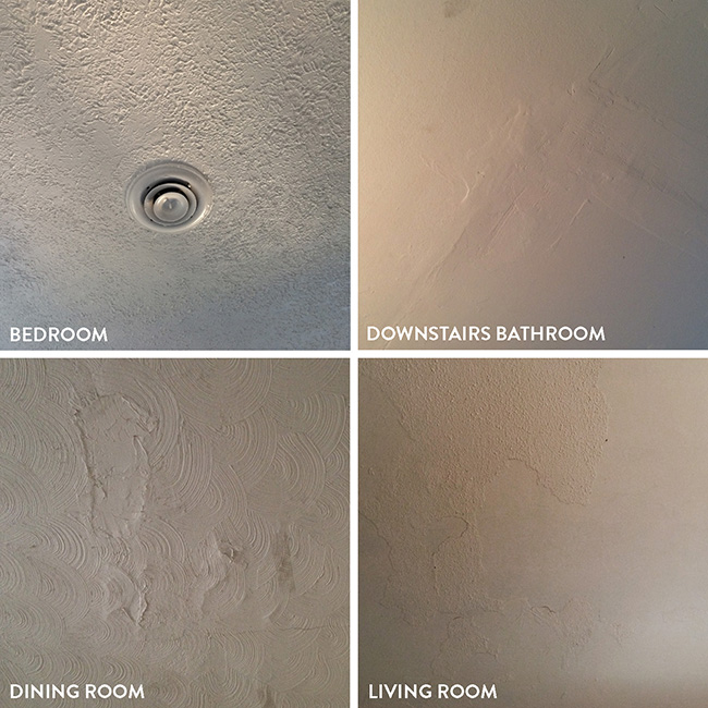
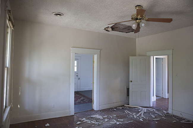
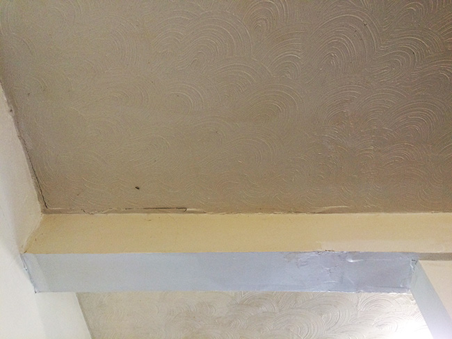
I mentioned in my last post that the ceilings in my Richmond house had issues. Seventy five percent of the ceilings had cracks that were covered with terrible swirly plaster designs or “popcorn” texture. Unfortunately, if there’s one thing in the design/build realm that i HATE doing, it’s anything that requires holding my arms over my head for extended periods of time. That includes installing crown moulding, replacing heavy/awkward light fixtures, and most of all—patching/sanding ceilings. Right off the bat I budgeted $5k to have someone else come in an fix them for me.

01pin it!

The selling agent didn’t include this picture in the listing…wonder why!? When I first saw this photo I was concerned that this damage was caused by a leaking roof which would have meant $10k+ out the window. My inspector figured out that it was actually caused by an improperly insulated vent that was causing condensation/dripping. My agent asked the seller to fix the hole before I bought the house, which was good but still not great. They just cut a patch piece and put a bunch of texture on it. The rest of the house was a mish-mosh of ugly ceilings of all types. I’m certain that all of these were just a band-aid to cover up cracked plaster.

I’ve met a good number of contractors over the years, and I find that many of them are reluctant to do drywall. It’s a skill that sounds easy on paper, but when someone doesn’t have passion or finesse for it, it takes forever and it winds up being a huge mess. Fortunately, there is a small percentage of dudes just LOVE doing drywall, and that’s the kind of guy you want doing your ceilings.  If this is something you ever plan on having done in your house, don’t hire a random person who says they “can” do drywall. Hire someone who ONLY does drywall.

04pin it!

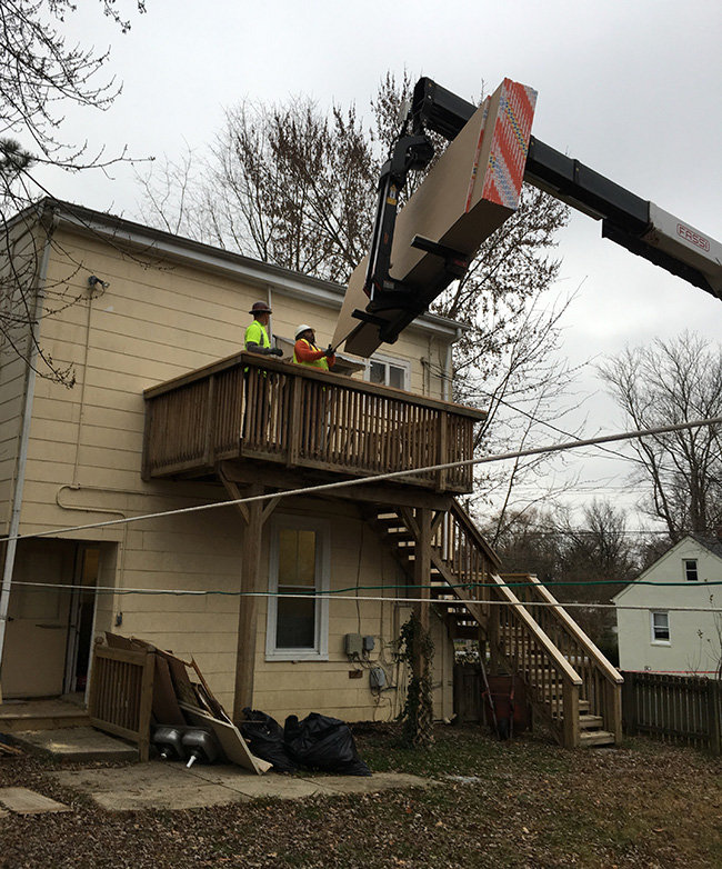
I hired a guy, Oscar to hang drywall over the existing ceilings. I figured with 10′ ceilings I wouldn’t miss the 3/8″ that I was losing. Oscar ordered 12′ boards for the new ceilings. We brought the ones for the ground level through the front door, and the guys used a giant crane to get the rest of the boards onto the 2nd story.

05pin it!

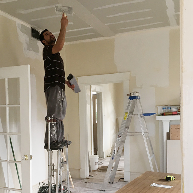
Man… I’ve said it once and I’ll say it again. I REALLY dislike doing any kind of work that requires my arms over my head for hours. I don’t know how these guys do it. I’m pretty tough, but patching ceilings is not for me. I love watching people apply joint compound, though. Its like watching someone ice a cake — so soothing!

06pin it!

In addition to patching the ceilings, we also patched the walls. The old plaster had cracked in tons of places, which is normal, but kind of ugly. This wall in the dining room was the worst. It was so bad that we skim coated the entire wall. That soft gray color is NOT paint. It’s wall-to-wall joint compound. Oscar said that we used more drywall mud in this house than he usually uses in 10 new homes. Whoops!

03pin it!

I talk a lot about the “invisible work” that goes into renovating an old space. It’s all the time that you spend repairing cracked/chipped/lumpy walls and trim. It’s kind of like plastic surgery for a house because it can literally make the house look decades younger if you do it right.  I admit I have a bit of OCD when it comes to this kind of work and it’s not unusual for me to do one round of patching/sanding/painting, then go over it all over again with a 2nd, 3rd or 4th round. It’s super time consuming, but it just feels so great when it’s done. In this house, I spent a good 2 weeks straight on patching and sanding alone.

08pin it!

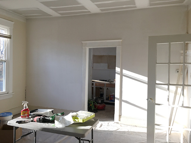
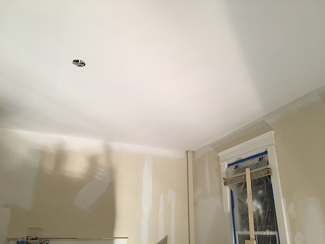
But in the end, I was thrilled with the new ceilings. Oscar did an awesome job, and they make the house look about 1000x more polished and welcoming. This is the dining room.

14pin it!

Kitchen ceiling before

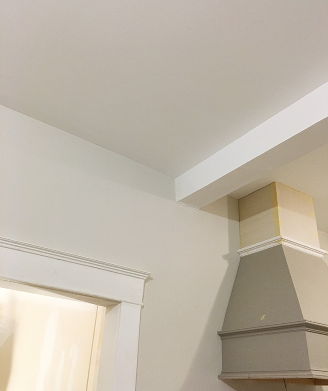
15pin it!

Kitchen ceiling after with a little sneak peak of the range hood I built. I’m putting together a big blog post about kitchen for next week. In case you forgot what it looked like before, here’s a pic to refresh your memory:

01pin it!

More on that later. Have a great weekend everyone!


Posted by Jen at 1:08 pm — 2 comments
Categories: ,
Jul 19

Jen’s Richmond Reno: How I Ended Up Buying a House in Virginia.

IMG_6630pin it!

My friend Christine is always right. I often ask for her input on everything from relationships to design to what snacks to get at Trader Joe’s and somehow, she always nails it with the analysis and feedback. She is bad-ass/hilariously dorky/good at everything and she just GETS IT. She gets the situation, she gets ME. Christine and I met in NYC but now she lives in Richmond, Virginia. She had been telling me for a couple of years that I should visit. She promised I would like it, and as usual, she was right.

I’ve traveled to a good number of cities around the world and it’s interesting how certain places tug on my heart strings a so much harder than others. It wasn’t until recently that I’ve been able to pinpoint the 2 things I that just get me every time: big old trees, and pretty old houses. And Richmond is full of both.

church 2pin it!

source

Christine lives in a spectacularly charming neighborhood called Church Hill. It is in fact named after a 275 year old church perched on a hill overlooking the James River. The neighborhood is approximately 15 square blocks of gorgeous-house goodness. When I visited Christine’s home for the first time, I burst out laughing because her place is ridiculously lovely and enormous. It’s a 1600 sq foot apartment on the top floor of a historic home with 11’ ceilings and 10 windows drenching the whole place in sunlight. I recall scurrying around her place taking photos and texting them to my friends living in over-priced urban hubs with lots of heart-eye emojis.

church 3pin it!

source

church 5pin it!

Christine and her boyfriend Miguel were dreamy hosts. Every day we would eat some kind of delicious pastry from some charming neighborhood joint, and stroll down one of the hundreds of beautiful blocks — each one seemingly lovelier than the last. I couldn’t help but notice the occasional “for sale” sign, and it wasn’t long before I became addicted checking Trulia 5 times/day and planning daily walking tours based on what homes were on the market.

churchpin it!

source

I’m from the San Francisco Bay Area where a one bedroom bungalow can run you almost a million dollars, so when I realized that I could acquire a relatively large property in a neighborhood of this caliber for less than $300k, I became obsessed.  I contacted the first agent I found online and started going to open houses.

COMPSpin it!

Over the course of a week we saw at least a dozen houses in varying states of disarray, and there were 3 or 4 times that I came very close to putting in an offer.
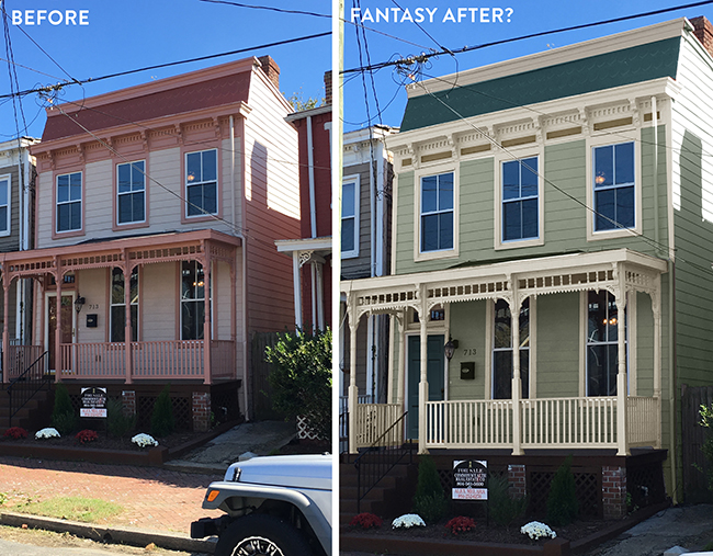
SF housepin it!

This was was a contender. It reminded me of a San Francisco Victorian and I couldn’t help but photoshop a new color palette that was more “me” just to see how it would look. I didn’t end up getting this one because Christine didn’t approve of the overly-modernized interior and the insufficient number of windows.

I was definitely overly-excited by how affordable everything was compared to NYC and California. Christine was with me every step of the way, politely putting me in check, telling me when I should calm down and hold out for something better. I didn’t want to buy a house that Christine didn’t approve of. After all, Christine is always right.

I had only intended on visiting Richmond for 6 or 7 days, but I wound up staying for 14 — on a mission to find an old fixer. I eventually left Richmond without buying anything. A part of me thought that if I left empty handed, I would lose momentum and lose interest in buying an investment property altogether, but that never happened.

A couple weeks later, back in Cali, I noticed a new house pop up on MLS. It was a 2000 sq ft 4 bedroom, 2 bath house on a 7000 sq ft lot with a garage in Montrose Heights, just 5 minutes from Church Hill. And get this… it was HALF the cost of the other houses I had been looking at. I really started to think that this could be perfect because I didn’t want to max out my budget on a home in an ultra-hot neighborhood leaving little or nothing in the budget for renovation. After all, I’m a designer and I’m doing it mostly for the experience, and not just for the financial pay-off.

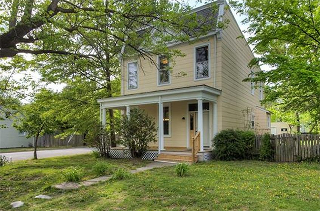
This house was on a lot and a half with a huge front, back, and side yard. It’s was on a street corner and had 19 windows so it was super bright (right, Christine?!) And there was a garage! Very few homes built before 1920 have garages. If they do, it’s usually a freestanding structure near the alley, which is what this one is. I was super excited and texted Christine to see if she could cruise by and check it out asap.
01pin it!

The neighborhood is not as majestic as Church Hill because the homes are more spread out and modestly sized, nevertheless the neighborhood is charming and quiet. Christine mentioned that she saw “gay pride flags and solar panels” so that was a good sign. She said that it was a really good house and that we should ask for a tour.

I called my agent and she was able to meet Christine at the house right away. They face timed me and I put in an offer immediately. The house had only been on the market for 4 or 5 hours, and I was the only person to view it in person. The selling agent must have thought I was nuts, but hey…that’s how we do it in California — early bird gets worm.

The seller accepted my offer right away and before I knew it, we were in the process of getting the property inspected. I’ll spare you all the super boring details, but in summary, here’s were the major problems with the house:

-Termite damage under the joists in the living room. The only way to repair this is by removing the (original) living room floors

-Somewhat old roof that may or may not need to be replaced

-A big hole in the ceiling caused by moisture from an improperly insulated a/c duct

-A few pieces of siding and trim chewed up by squirrels on the exterior of the house

Honestly, not a bad report card for a 106 year old house. Despite these issues, I decided to proceed with the purchase anyway. After a long-ish closing, I finally flew to Richmond to see the house for the first time, and to sign my name on a thousand papers. Here are some pics and some notes room-by-room.
02pin it!

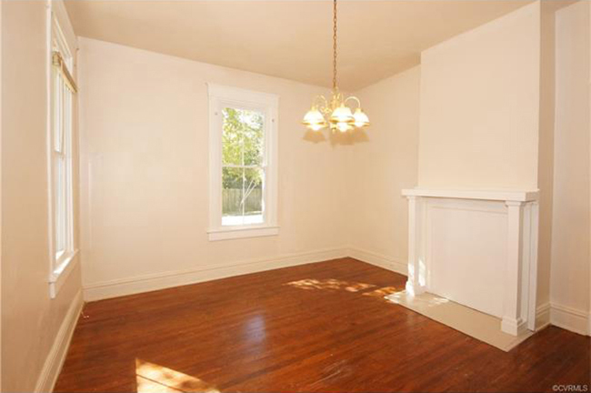
Living room – It’s not terrible, but that light has to go. I plan on installing ceiling fans throughout. Because this is the first room you see when you walk in, I want to demolish that fireplace and replace it with something more elegant and period-appropriate.
 

03pin it!

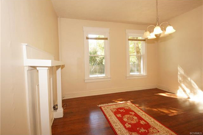
Dining room – This room is very similar to the living room, but it’s actually even bigger. It also has a pretty ugly mantle which I plan on replacing. The dangling pendant has to go.
 

04pin it!

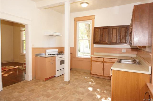
Kitchen – The layout is going to stay. I plan on demolishing some cabinets and keeping others. That range hood is S.A.D. I’ll bring in some rustic wood shelves and new beadboard to freshen up the space. The floor is kind of ugly, I’m considering replacing it.
 

05pin it!

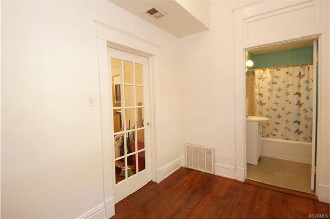
Downstairs hall and bathroom – This is where the washer and dryer went (pretty much right where I’m standing.) That’s going to be a huge eyesore so I’m going to build a new closet to hide them.
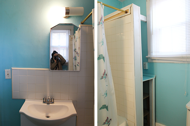
 

bathroompin it!

This bathroom is pretty hideous. At first I was hoping to save the tile around the tub, but it’s cracking because the divider wall is built so poorly that it moves when you put pressure on it. Everything but the tub must go.
 

06pin it!

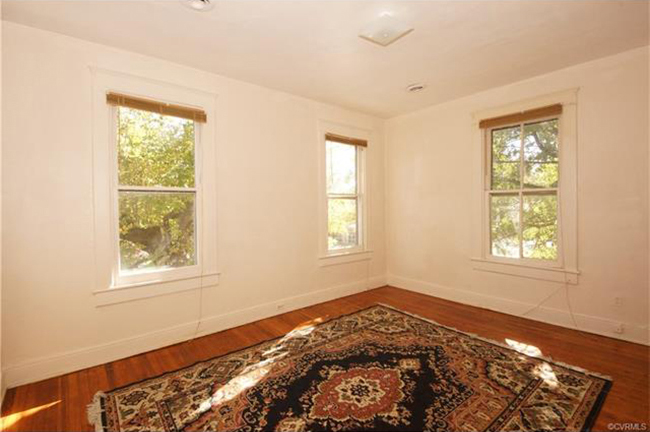
Bedroom – Best room in the house. Patch/paint/new trim and we’re good to go.
 

07pin it!

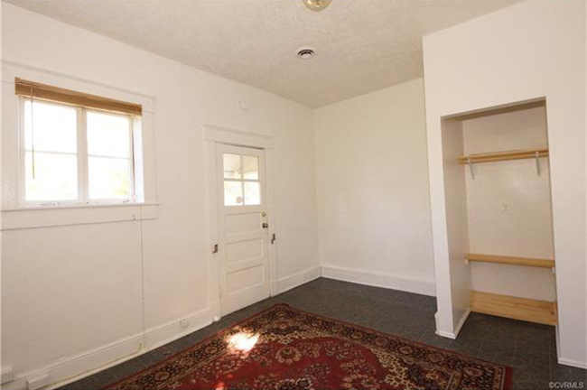
Office – This weird little room used to be an upstairs kitchen back in the day when the owner converted this house into a duplex. I’m going to rip up this linoleum, restore the floors, and put a door on that little closet.
 

08pin it!

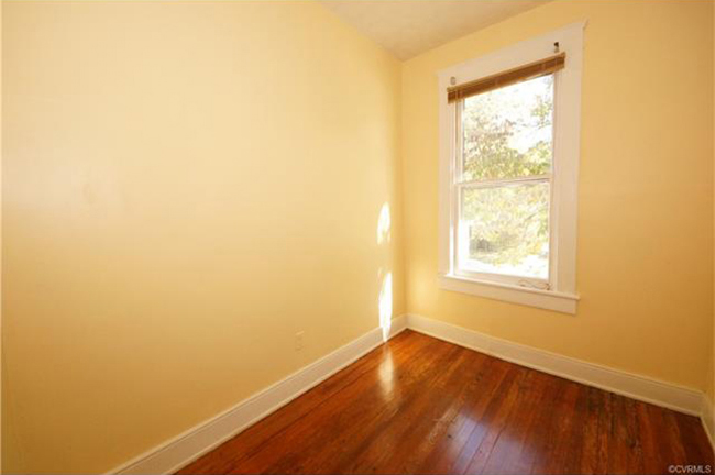
Tiny room – This one is easy. Patch/paint/new trim and we’re good to go.
 

09pin it!

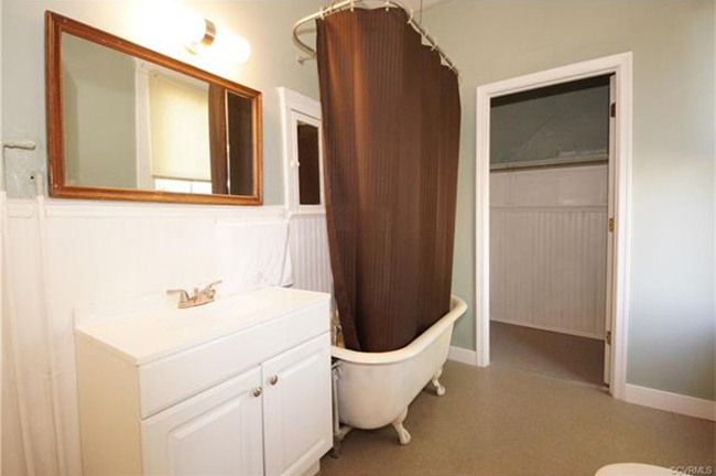
Upstairs bath – This room looks better in the pictures that it does in person. This beadboard is ROUGH, and the tub is very damaged. The floor is depressing. The only thing it has going for it is the big window that lets in tons of light.
 

10pin it!

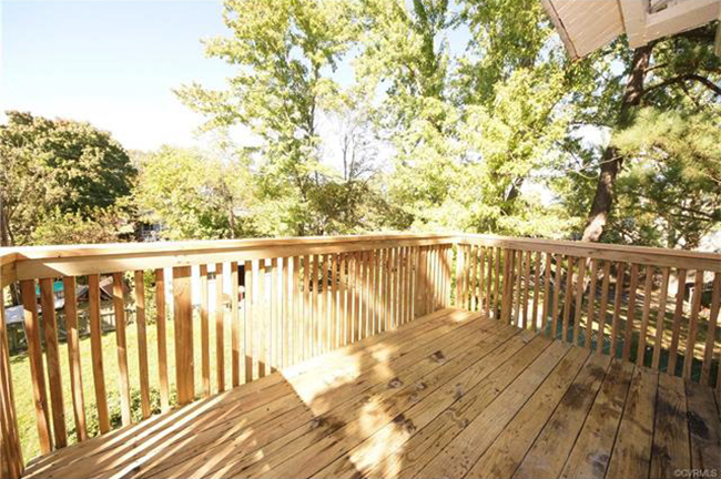
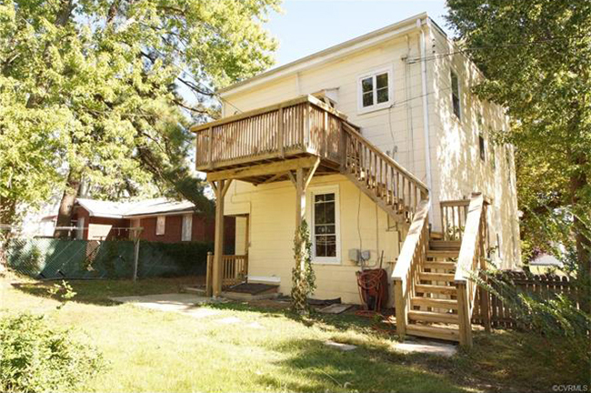
Balcony – Even though the previous owner did all kinds of weird things to the house in order to turn it into a duplex, the one good thing that came out of that was this balcony. I’m assuming it was built as a second form of egress. It’s well-built and one of my favorite features of the house.
 

11pin it!

Yard -The yard is pretty massive. Aside from a bit of fence repair, and a good mowing, I’m don’t plan on doing much.
 

12pin it!

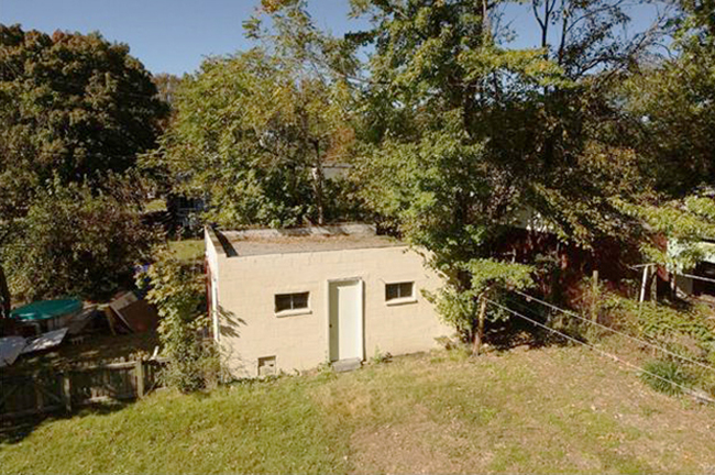
Garage – Also known as “tiny Alamo prison.” This garage is probably not going to be used to house cars any time soon because the door is a GIANT, 1000 lb sliding barn door and not one of those nifty modern doors that go up at the touch of a button. I’m just going to clean it out and call it “storage.”
 

RVA LAYOUTpin it!

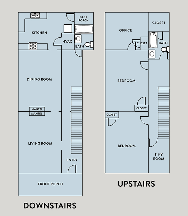
The layout is pretty typical for a home in Richmond — sort of narrow, really long, common areas downstairs, and sleeping rooms upstairs.

A few things that are a total bummer that don’t really affect the inspection process, but I really need to change  for aesthetic reasons:

-The ceilings in almost every room are cracked/textured/stained and just hideous overall. The house needs new ceilings throughout

-A lot of the walls have cracked plaster that was poorly patched. I’m extremely OCD when it comes to smooth walls, so I know there will be many days and nights of patching/sanding ahead.

-The kitchen is a hot mess, but some of it should be salvageable. This is going to be the first project and I have a huge kitchen reno post on the way!

-Both bathrooms need a lot of cosmetic work. The linoleum is terrible, the claw foot tub is chipped and scratched in a million places, and there’s a lack of storage.

I consider this a “light fixer” and I plan on working on it in between TV gigs. I know it’s going to be challenging, and probably twice as expensive as I would like it to be, but I could not be more excited. No, I am not planning on moving to Richmond. As wonderful as it is, my heart lives in Brooklyn, and my paychecks live in Los Angeles, so I’ll just enjoy my time in Richmond for the next few months until I finish the reno and rent this out.

I’m so grateful for my dear friend Christine who helped me make this happen. Her enthusiasm for her neighborhood was contagious and I would never have taken on something this huge without knowing that my wise little sister-from-another-mister would always be nearby. Most of the time, I’m totally stoked and confident that this is going to be amazing, but every now and then I wonder if I’m quickly draining my life savings for the sake of having a big project to fill my art void. But then I think about how Christine says that it’s a great house and it’s a good investment. She better be right…she’s always right.
 

Posted by Jen at 4:35 pm — 2 comments
Categories: , ,